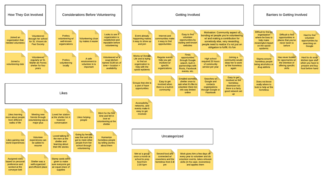
ResearchWe wanted to better understand how our users find volunteer opportunities and what they look for in an organization before volunteering with them. We conducted interviews with three participants to gather information on our users and later sent out an anonymous survey to ten participants.
After conducting an affinity analysis and analyzing survey results, we ended up with the following three key findings:
SketchesHere are a few of my website sketches based off the research.
Storyboard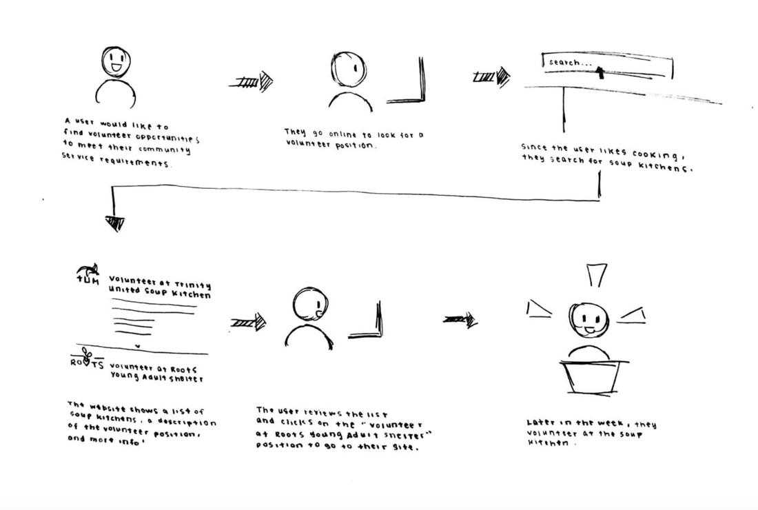
Storyboard created by Helene Shea showing how participants
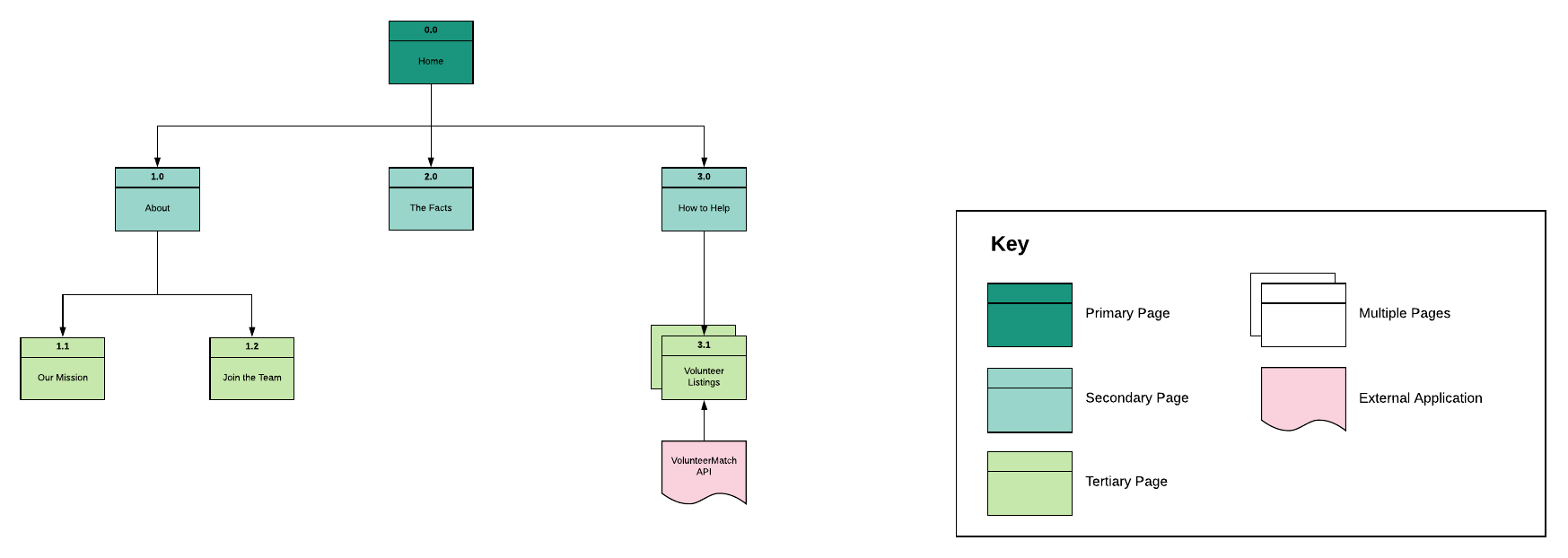
might find opportunities based on their interests. Information ArchitectureWe kept our site simple to be able to code it later. We had an "About" page for our organization, a "The Facts" page dedicated to facts surrounding homelessness in Seattle to build empathy, and a "How to Help" page where users can search for different opportunities based on their interests and location. In our original plans, we were going to utilize the VolunteerMatch API for local volunteering opportunities.
WireflowsI created the wireflows for our team in Lucidchart. The wireflows different versions of the "How to Help" page interactions. All versions give you the option to filter results based off the type of volunteering opportunity such as "tutoring" and "childcare".
Version A you see organizations listed and has a search bar. Version B has no search bar and has organizations listed. Version C has positions within organizations listed. Click Tests/Post-Task QuestionairreHelene created three high-fidelity screens of the "How to Help" page for click testing. Our results are somewhat inconclusive, because our four participants would click in different places for the same task, even if there were minimal changes that did not affect where they originally clicked.
After analyzing our click tests and post-test questionnaire, we ended up with the following three key findings:
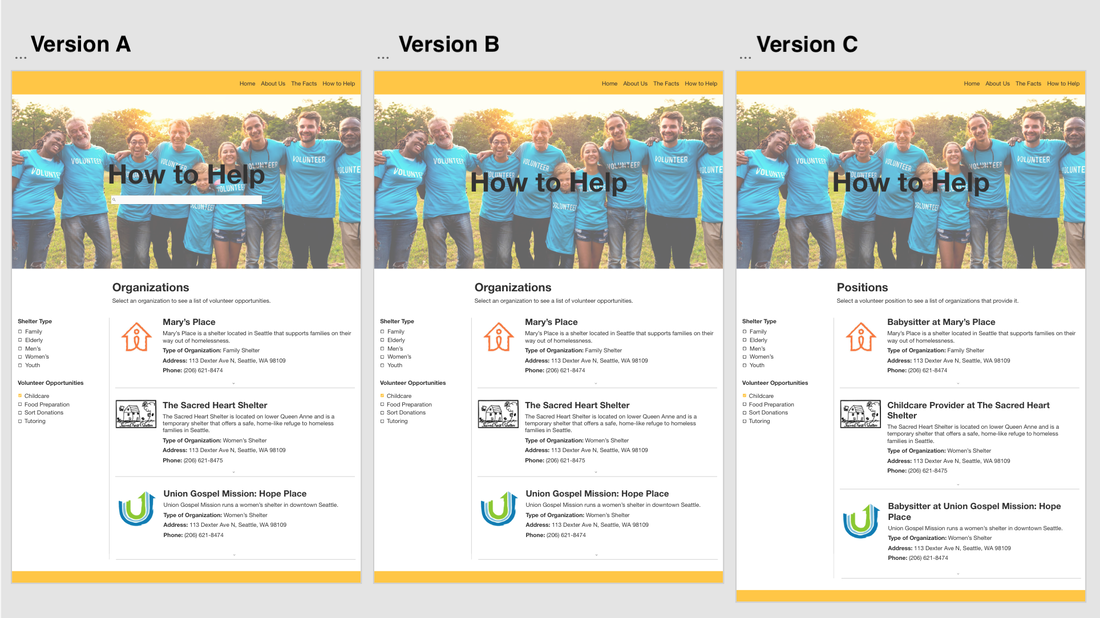
Version A has both a search bar and a filter, whereas Version B and Version C only have filters. At the same time, version A and version B display volunteer listings by organization, whereas version C displays volunteer listings by volunteer positions. Below are the high-fidelity screens that we used for click testing.
High Fidelity MockupsWe created high-fidelity mockups of the website and later coded it using the Javascript library ReactJS. The site did not end up being fully completed due to time constraints.
Click here to access website. |
|
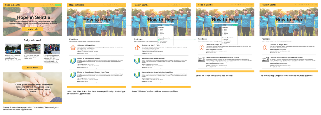
High fidelity wireflow created by Helene
ReflectionJust like a lot of my other projects, I enjoyed working on this site. Seattle has a major issue with homelessness with a lot of stigma's surrounding people who need compassion. It was interesting for me to deep dive into how and why people get involved with volunteer organizations so we could create a good site.
The biggest challenge with this project was coding the site. I've taken a few programming classes before but I have never used ReactJS or implemented Material UI before. Helene and I managed to code a basic version of our site. My proudest moment was when I figured out a way to create a responsive navigation bar! The second challenge was click testing, as I had little experience with it previously. I realized that it needs to be made clear to users that they have to go about the task just as they usually would. I think the users would expect some dramatic difference each time and would click around our screen looking for the changes which affected our results. However, the post-task questionnaire saved that session. |