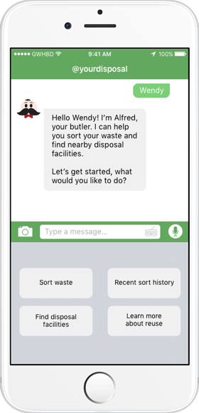
@yourdisposal
Intro to User Centered Design
Spring 2017
|
|
During my spring quarter at the University of Washington, I took part in the class Intro to User Centered Design. It was the first time I had the opportunity to take part in a full UX design process. It was not as extensive as it is in the job world since we only had a quarter to put everything together, but regardless it was a major learning experience. My group, Guys Who Hate Bad Design, decided to work on the project @yourdisposal, an app to help users properly dispose of their waste. Below I will detail some of my contributions to the group, our full group portfolio can be accessed with the button below where we go through:
1. Research 2. Personas 3. Design requirements 4. Design sketches 5. Storyboards 6. Sitemap 7. Paper prototypes 8. Evaluations 9. Annotated wireframes 10. High fidelity mockups 11. Group reflection |
Problem Statement |
|
Waste typically does not reach its rightful disposal destination because people lack the knowledge and incentives to engage in sustainable waste management. Both common and uncommon items are difficult to immediately categorize, and individuals may not be aware of nearby waste disposal locations and availability. Currently available resources suffer from information overload, or prove to be insufficient in categorizing a variety of items.
|
Vision Statement |
|
@YourDisposal will help users participate in sustainable waste management by allowing them to sort waste efficiently and feasibly. Our goal is to provide users with the resources for proper disposal methods and locations that will help establish sustainable behavior and support user change.
|
Research Findings |
|
|
|
Our research was divided into two parts: competitive analysis and semi-structured interviews. For our competitive analysis, we looked at various applications that addressed the same problem we identified; we then analyzed the pros and cons for all of those competing services. Our targeted user group was going to be people in temporary housing since they would be moving around often and likely tossing out items that do not have a clear destination. As a group we interviewed various people from fraternities, sororities, and off-campus apartments and housing.
For the semi-structured interview, I interviewed a 19 year old UW student who was experiencing her first year at UW in a sorority with 80-100 other girls. Some main points I gathered from my interviewee was that the sororities are held to a high standard of cleanliness and they often have to take out their trash, larger items need to go outside to the dumpster, and she has been unsure in the past how to dispose of items like pop-cans. In addition to that, the go-to answer for large items such mattresses and couch was to leave it by the dumpster if it is small enough or take it to Waste Management, but no specific facilities were mentioned. The whole process of waste disposal was a hassle to her. RecycleNation was one of our competitors that I analyzed. I liked how they organized items into easy to find categories though I did not like how swiping led to a full category page. The two dots implied just that row would change to three more categories so it surprised me. I liked the tips as it informed users about environmental effects and the log was a way to incentivize people to recycle but I question how often people would stay motivated with that. My full write-up can be found in the pdf below the images to the left. |
| ||||
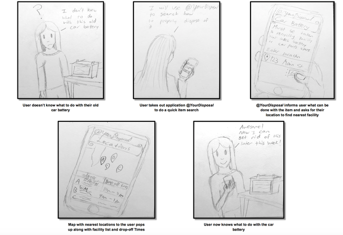
Storyboard |
|
Each of our team members went through a different imagined different scenarios that our users could potentially go through. I went through the process of tossing a laptop or car battery since they are not items someone can toss into the trash because of the toxic chemicals.
I will point out that I did not own any advanced tools like Sketch or Illustrator yet at this point so I struggled to put our prototype screens in Microsoft Word which is why they are not aligned. I also learned that drop shadows shouldn’t be used it clutters up the document, and I kind of went drop shadow crazy for these type of documents. But future documents will not have this issue anymore! 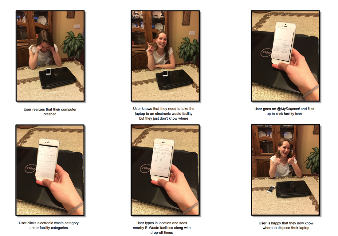
|
Design Sketches |
|
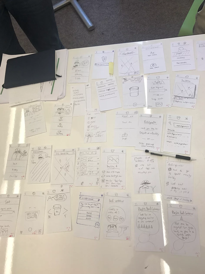
With our personas and design requirements completed, we began to brainstorm as many design ideas as we could. This was done both individually and in groups. We then pooled our ideas together and critiqued our sketches by discussing the strengths, weaknesses, feasibility, and originality of each of our ideas. From here our group was able to choose the three most promising ideas and refine them. By analyzing the strengths and weaknesses of these refined sketches, we laid out the groundwork for creating our storyboards and overall flow.
|
Prototypes and Evaluation |
|
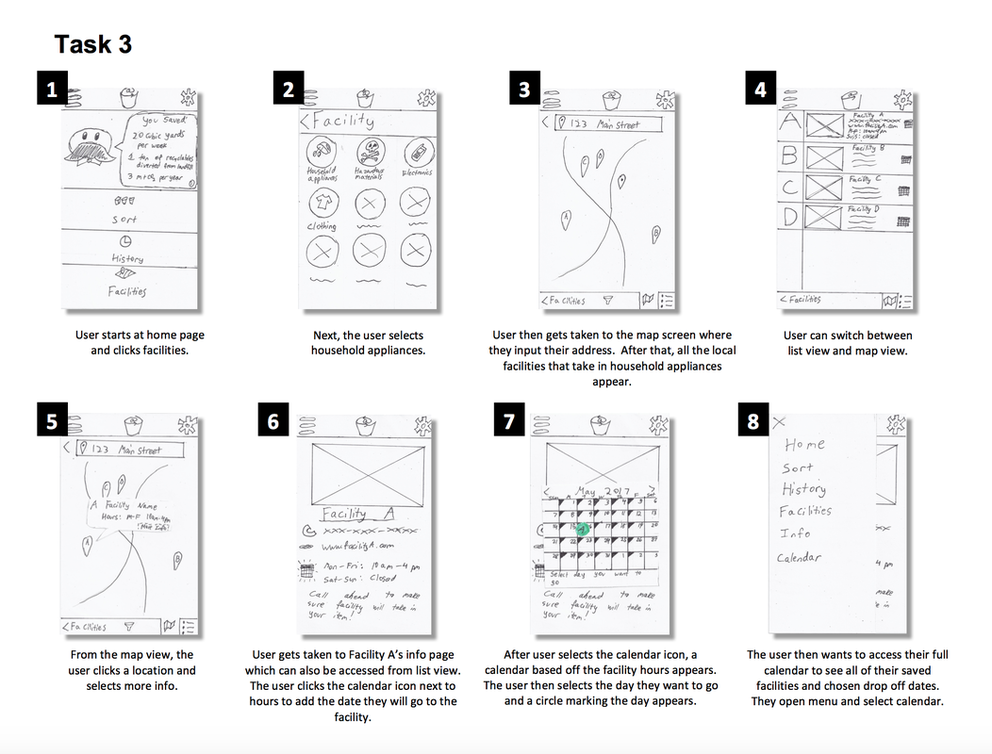
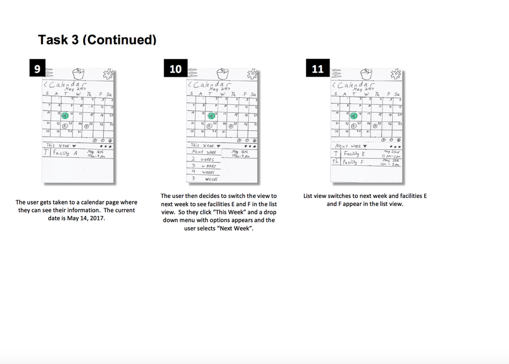
As a group we came up with three tasks that we ended up creating paper prototypes for. The goal was to identify issues with the navigation, purpose, and UI of our application. I sketched out and ran a user test on task 3 which was to have the user dispose of a refrigerator.
The user was to mark a calendar with a drop-off time and date to dispose of a fridge and knowing that it must be taken to a facility for disposal, the user seeks detailed information for one of the nearby facilities. The user finds the facility that best fits their needs and uses the in-app calendar to record a time frame that works for them. I ran this test with my interviewee from the semi-structured interview. Some insights gathered from my run through with her was that she struggled to find the calendar since she "thought she could access it through the calendar that popped up on the facility page." She did not even realize there was a main calendar in the app. Our participants found issues with navigating the filter screen, my participant did not consider filtering at all and just thought to access all the facilities on the map right away. She did enjoy the "fun facts" on the home screen and thought that made the app more interesting. Some changes we decided to implement based on the teams ocmbined results was to ad a button that allowed the mini calendar on the facility page to expand into a full screen calendar so the awkward transitions would be minimized. We had a few redundant features so we went over the flow of the calendar to see if transitions could be made more intuitive. In addition to that, the filter screen on the map page was not recognizable by our users so we aimed to make our high-fidelity prototypes and wireframes to have a simpler filter screen layout. We kept in mind that this could have been caused by the poor quality of some of our screens. |
|
|
High Fidelity Prototypes |
|
|
|
| ||||||
Group Reflection |
|
Overall had a really fun experience, but we definitely ran into challenges here and there. One of these challenges was that major design decisions would leave us debating for hours before finally coming to a decision. This included things like: Whether to implement full conversational UI, if we should have horizontal or vertical movement across our screens, what features were most important on the home screen and whether we needed a calendar or not. If we had more time, more user research and user testing would have been useful to figure out what was the most efficient solution.
We also did not have enough time to figure out what medium would be best for our users, so we assumed that a mobile application would be best. Also, the nature of our project had us analyzing countless of different scenarios that our users could go through. Many items could fit into more than one category, waste disposal facilities for certain items might not exist in some areas, and so on. Once again, due to time constraints we picked a few scenarios and worked with it to not overload our app with too many features. As a team, we worked really well together. We were almost always on top of it and managed to get things done, even with bumps along the road. Even though it won’t always be this way, we got lucky that we ended up with a group that got along so great. Throughout all the hard work we still managed to keep up a sense of humor which kept up group morale. Whenever our schedules allowed it, we met up in person, and when we couldn’t, we had plenty of Google Hangout sessions to get things done. |
|
|
