|
|
Project Managers: Andrei Villasana and Katherine Li
UX Team: Inhae Kim, Jae Jung Park, Monica Posluszny Development Team: Quan Tran, Frank Zhu, Jong Ho Lee, Jacob Lu, Richard Jiang UX Programs Used: Invision, Sketch Iris is an insta-message application designed to help make communication more efficient between homeless shelters in Seattle. Case workers often have long wait times and are overloaded with cases. Additionally, there are various problems regarding referrals and getting the homeless into shelters after hours. Our goal was to mitigate some of these problems with this application. During the design of the application, it was important to maintain security and confidentiality on it. Results of our project below are based under the assumption that organizations are still responsible for making sure the data they choose to transfer is HIPAA-compliant. To read more about the start of our project, visit this Medium post. |
Research |
|
We started off by contacting two different organizations. I moderated both semi-structured interviews with employees to find the main problem points when communicating between shelters to help the homeless.
After transcribing our recordings, coding the interviews, creating affinity diagrams, and creating a persona, the problem points we decided to hone in on were:
|
|
|
Ideation
Once we sifted through our research, we put it together into user/stakeholder requirements list and a persona to share with the team. We ran a design charrette to gather feedback and design suggestions from everyone. After gathering ideas, we ran more design sessions to get all of our ideas out.
Prototype 1 |
|
After critiquing and narrowing down our ideas, we created an initial paper prototype in Invision.
Scenarios we designed for initially
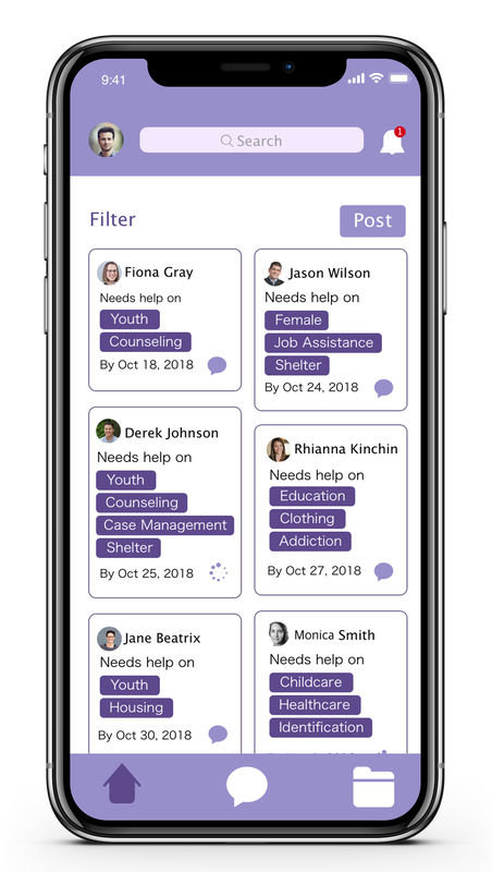
In prototype below, you can post about what you need help with, picking specific tags. People who have job positions/experience associated with the tags can contact you through the post. The home page is a general newsfeed section connecting all the organizations in Seattle. The search feature lets you search people or organizations. In this example, you can search an organization and the organization profile appears or the people who are associated with it. It also shows whether they are set to online. |
|
|
User Testing |
|
We went back to our initial interviewees to obtain feedback on our first prototype using the above scenarios. For our next iteration, some of the feedback we decided to focus on was:
Additionally, based off earlier interviews, we designed a way to track individualized goals. |
|
|
Wireframing |
|
After receiving the feedback, we forged ahead into wireframing, taking into account what we learned. We designed the workflow for creating an account, sending messages, creating posts asking for help among shelters.
|
High Fidelity Prototype 2 |
|
As we worked on this project, we looked into things that had a symbolic meaning to come up with a name. Blue-Iris's represent "hope" so we chose this as the name of our application. The Blue-Iris looks fairly purple so we went with a purple color scheme for our project.
Below you can view two embedded videos showing how you can access and create individual goals and find a profile by searching an organization in our application. The rest of our prototype videos can be found at this link. All interactions shown in the videos below are under the assumption that the users had their clients fill out R.O.I's (Release of Information).
|
ReflectionThis project has been a fun but intense experience. This is a topic I care about because Seattle has a major homelessness epidemic and people really need to provide help in various ways to really pull people out of it. This was one way for me to really dive into the topic and really learn about all the issues that case managers encounter behind the scenes.
I loved working with my group members and we got along well. We would enter into many design discussions debating what would be best for the project until we reached a consensus. I think the biggest challenge we encountered (at the very least it was a major challenge for me) is that we were the most experienced UX people on the team. As students, not having guidance from someone with multiple years of experience and second guessing many of our decisions proved to be difficult at times. But it forced us to research best practices for problems we ran into so we learned a lot. This also made us heavily rely on each other to fill in each other's knowledge gaps which made for a good teamwork environment. This isn't a completed project. There is a lot of room for improvement and there needs to be way more usability testing done with more organizations to really pick out all the problems in our design. Regardless, with the time we had, I am proud of the work we put into it and the design we came out with so far. |